Martian Monopoly
Submission to Clicker Jam Winter 2023.
This was my first-ever attempt at making a clicker/idle game. Honestly, I didn't expect it to be so complicated to make, but I'm nevertheless happy with how this game turned out.
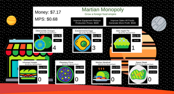
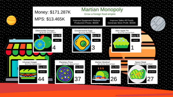
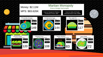
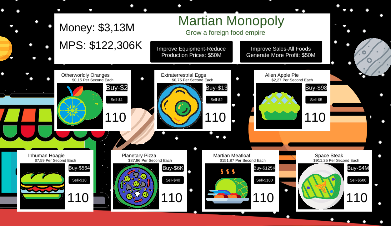
In this game, you are in charge of a new business in a new market, a restaurant on Mars. When you buy foods, they generate profits automatically. With these profits, you can buy more foods or upgrades that help you grow your business even bigger. Make millions and take the food business of Mars by storm!
Attributions for artwork:
Sandwich icons created by Freepik - Flaticon
Apple pie icons created by afitrose - Flaticon
Yolk icons created by Umeicon - Flaticon
Fruit icons created by Freepik - Flaticon
Meatloaf icons created by Flat Icons - Flaticon
Meat icons created by Triangle Squad - Flaticon
Pizza icons created by Freepik - Flaticon
Planet icons created by Freepik - Flaticon
Shop icons created by Freepik - Flaticon
Venus icons created by tulpahn - Flaticon
Planet icons created by monkik - Flaticon


Comments
Log in with itch.io to leave a comment.
Jajajaja... no creí llegar tan lejos... resulto ser muy adictivo...
y me gusto la música también...
I liked the game, but I wish I could set the volume of the music
It's a decent game, but I don't like the art style clash.
I LIKE IT
The prices are truncated, so you can't see the actual costs, which are increasing every purchase. But, eg, the last one can cost almost 2K and still _say_ 1K as the price (but trying to buy it won't work)
This is on purpose, if I showed the full prices inside of those buttons I would not have nearly enough space, so I had to truncate and round the prices.
Yeah, but that's such shit design, why not put the price somewhere else and just put "buy" or something of the sort on the button instead?
I had experimented with all sorts of different placements for the price and I decided to round and truncate them. Through my testing, I found it as the best placement and rounding for the price.